What Is the Old Money Color Theory?
Ask around and you’ll hear a familiar line: The Old Money aesthetic is defined by a timeless, refined color palette that reads elegant without trying. That idea sits at the heart of what many stylists (and savvy shoppers) now call old money color theory—a practical way to build outfits from a small group of quiet, heritage-driven hues that always look composed, pair easily, and age well.
Mainstream fashion writers note that the modern “quiet luxury” look leans on soft neutrals—cream knits, navy blazers, dark denim—over loud logos. Historians trace the roots further back to the early 19th century shift led by Beau Brummell, when color and ornament retreated from menswear in favor of restrained tailoring, a move that still shapes how upper-class wardrobes read “old money” today.
In this 1,600+ word guide we’ll define the palette, decode why these colors work psychologically and practically, map seasonal swaps, and show you how to build a capsule using three oldmoney.net collections:
Let’s dig in.
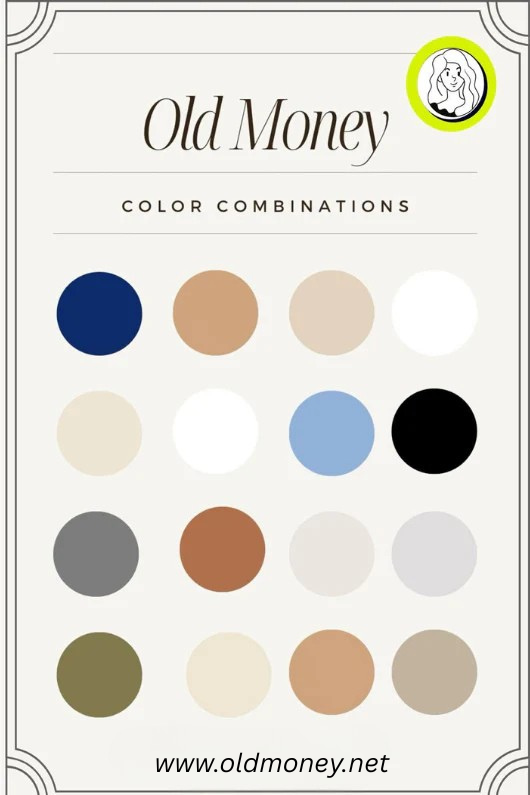
1. Quick Definition: Old Money Color Theory in One Minute
Old money color theory is the practice of dressing from a disciplined hierarchy of colors that signal heritage, restraint, and longevity. Three pillars drive it:
-
Foundational Neutrals – Low-chroma, wardrobe-glue shades (navy, cream, charcoal, camel) that mix across decades and patina gracefully.
-
Heritage Accents – Deep, club-coded colors historically tied to schools, regiments, and sporting traditions (hunter green, burgundy, regimental stripe blues/reds). Used sparingly.
-
Seasonal Washes – Weathered pastels or sun-faded brights (Nantucket red, sky, butter yellow) that appear in warm months but never swamp the base.
Keep 60% of an outfit in foundation neutrals, ~30% in secondary support tones, and <=10% in accent color. That ratio prevents clashes and delivers the “quiet” part of quiet luxury.
2. Why Color Matters More Than Logos
Logos date; color stories carry across eras. When you see a cream cable knit over navy trousers you read “country weekend” without needing a crest. A charcoal blazer over stone chinos signals boardroom calm. Even inexpensive garments look richer when their colors echo traditional codes. In other words, palette is leverage—you can buy smart and look elevated.
3. The Historical Roots (30-Second Timeline)
Regency Reset: Beau Brummell popularized severe, well-tailored dark coats worn with stark white linen—an aesthetic break from the saturated silks of earlier courts. This pivot toward restraint birthed the modern menswear neutral base.
Institutional Colors: British public schools, rowing clubs, and military regiments adopted stripes and trim colors—small doses of saturated hues against dark grounds. The pattern: neutral first, color second.
Transatlantic Prep: Ivy League campuses and coastal leisure sports (sailing, tennis) cemented navy, white, and grass or “tennis” green as status shorthand. Faded reds from sun-bleached chinos joined later.
Those habits accumulated into today’s old money color palette: largely neutral, punctuated by tradition-coded accents.
4. The Old Money Color Ladder
Think of the palette as a ladder from light to dark. You climb (or descend) as formality and season shift.
4.1 Light Tier (Base Highlights)
-
Ivory / Cream / Ecru: Warmer than optic white; softer on skin; hides slight wear.
-
Pale Blue: The workhorse dress-shirt shade; brightens faces in photos.
-
Stone / Light Khaki: Neutral trouser base for spring/summer; pairs with everything.
4.2 Mid Tier (Everyday Backbone)
-
Camel / Fawn: Knitwear, topcoats, scarves; warms cool palettes.
-
Mid-Grey: Versatile suit and pant tone; accepts both brown and black leather.
-
Olive Drab: Country outerwear; mud-friendly; pairs with cream and burgundy.
4.3 Dark Tier (Anchor & Formal)
-
Navy: The universal anchor—jackets, knit vests, outerwear.
-
Charcoal / Graphite: Urban tailoring; reads sharper than navy at night.
-
Deep Chocolate Brown: Footwear and leather trim; soft alternative to black.
5. Heritage Accent Family
Use these in small hits—ties, belts, stripes, logos scaled tiny, knit trim.
|
Accent |
Where It Came From |
How to Use It |
|
Hunter / Racing Green |
British countryside, turf sports |
Sweaters, outerwear linings, belt webbing |
|
Burgundy / Oxblood |
Club ties, equestrian tack, vintage footwear dyes |
Shoes, leather straps, tartans |
|
Regatta Blue + Maroon Stripes |
Rowing clubs, school colors |
Neckwear, grosgrain trim, socks |
|
Nantucket Red (sun-faded) |
Coastal New England chinos bleached by salt & sun |
Summer shorts, caps |
|
Gold Braid / Brass |
Military dress accents |
Buttons, buckles—keep matte |
Accent = spice; too much and the stew shouts.
6. Texture Changes Color
Old money wardrobes rely on texture shifts to keep neutral palettes interesting:
-
Matte vs Sheen: Flannel absorbs light; satin reflects. Pair a matte flannel pant with a subtly lustrous silk scarf and you’ve added “color contrast” without new hue.
-
Pile Height: Corduroy vs smooth cotton reads as a darker/lighter version of same color.
-
Patina: A scuffed brown loafer slowly cools toward umber; aged brass buttons go olive; plan for the fade.
Texture is why two navies can live in one outfit—they’re different fabrics.
7. Build Your Palette by Garment (Internal Links)
7.1 Shirts: Your Light Tier Workhorses
Start with pale blue, cream, and soft stripe Oxfords; then add seasonal gingham in muted tones. Fabrics with a bit of loft or slub hide wear and wash well—ideal if you rotate a tight color family.
7.2 Pants: Mid & Dark Tier Anchors
Aim for stone chinos, mid-grey flannels, and a deep navy or olive drill for cooler months. Subtle herringbone or whipcord adds depth without visual noise.
7.3 Accessories: Accent Control Center
Ties, belts, scarves, pocket squares, watch straps—the safest place to experiment with hunter green, burgundy, or club stripes. A single accent item updates a whole neutral outfits.
8. Value Balance: 60 / 30 / 10
A dependable dress rule: keep roughly 60% of visible outfit in one neutral value family (light or dark), 30% in a supporting neutral of opposite value, and 10% in accent or pattern. Examples:
-
Cream cable (60) + navy chino (30) + burgundy belt (10).
-
Navy blazer (60) + stone pants (30) + regimental tie (10).
-
Charcoal suit (60) + pale blue shirt (30) + forest pocket square (10).
You don’t need a calculator; eyeball mirror proportions.
9. Warm vs Cool: Temperature Tweaks
Skin undertone influences which neutrals glow on you:
Cool / Pink undertone: Lean into navy, charcoal, true white, blue-grey.
Warm / Olive undertone: Camel, cream, olive, warm navy, chocolate.
Neutral skin: Mix freely; use contrast (light shirt / dark jacket) to frame the face.
If you’re unsure, place fabric under natural daylight against your jaw. If skin looks sallow, switch the temperature.
10. Seasonal Color Swaps
Spring
Light blues, soft greens, stone trousers, pale yellow knit drapes.
Summer
White/cream linen, faded reds, nautical stripes, navy shorts.
Autumn
Camel, rust, olive, mid-grey flannel, burgundy leather.
Winter
Charcoal, navy, blackwatch tartan accents, deep forest scarves.
Rotate fabrics with the season—linen to flannel, canvas to cord—but keep palette continuity so pieces layer.
11. Pattern Rules (When & How)
Old money palettes often show up inside patterns:
-
Striped Oxfords: Pale blue/white or cream/green; low contrast.
-
Tartans & Plaids: Dark ground, a line of red or yellow; keep scale small.
-
Regimental / Club Ties: Diagonal stripes; choose one with your accent shade; wear with solid shirt.
-
Fair Isle / Intarsia Knits: Use 2–3 family colors max; earth + cream.
If pattern size overwhelms, treat it like an accent—under a blazer or in a scarf.
12. Color Maintenance = Longevity
Neutral palettes only read “old money” if the colors stay clean and even.
Wash Lights Separately: Creams pick up dye; launder with like shades.
Cold Water for Blues: Prevents navy fade streaks.
Sun Dry with Care: UV softens color—great for Nantucket red; bad for charcoal suits.
Spot Clean Accents: Burgundy silk ties and green cashmere pills show fast; use proper tools.
Keep a swatch photo library on your phone; when replacing items, match tone.
13. Five Ready-Made Old Money Palettes
A. Coastal Classic
Cream, navy, pale blue, brass. Accent: Nantucket red shorts.
B. Countryside Autumn
Olive, camel, burgundy leather, cream shirts.
C. City Minimal
Charcoal, black, white, tiny silver metal accents; one forest green scarf.
D. Ivy Prep
Navy blazer, stone chinos, pale blue shirt, regimental tie (navy/green/red).
E. Winter Club
Grey flannel suit, cream cashmere rollneck, oxblood shoe, tartan pocket square.
Mix and repeat; you’ll notice each relies on 2–3 neutrals plus one accent.
14. Capsule Builder Worksheet
Use this planner to audit your closet:
|
Category |
Color Slot 1 |
Color Slot 2 |
Accent Slot |
Status |
Notes |
|
Shirts |
Pale blue |
Cream |
Stripe (blue/green) |
Need 1 |
Replace worn collar |
|
Pants |
Stone |
Mid-grey |
– |
OK |
Add olive for fall |
|
Knitwear |
Navy |
Camel |
Fair Isle (burgundy line) |
Need 1 |
Watch pilling |
|
Outerwear |
Navy blazer |
Olive field |
– |
OK |
Dry clean |
|
Accessories |
Brown belt |
Brass buckle |
Regimental tie |
Add |
Check width |
Fill it in quarterly; the palette stays aligned.
15. Old Money Color FAQs
Is white allowed or must it be cream?
Both. Optic white is crisp for shirting; cream hides wear and reads softer. Use white sparingly off-season.
Can black be “old money”?
Yes, in eveningwear and urban tailoring. Pair with high-quality fabric and minimal shine. Black head-to-toe daywear can skew fashion-editors; temper with camel or grey.
What about the bright colors I love?
Limit to accessory pops. A bright pocket square against neutrals feels intentional; a neon jacket breaks the code.
Do metals count as color?
Definitely. Choose matte brass, aged silver, or gold in small quantities; high polish reads flash.
16. Putting the Theory to Work (Action Plan)
Today: Pull every top you own; sort by color family (light, mid, dark).
Tomorrow: Do the same with pants; note gaps (do you own any camel? mid-grey?).
This Week: Choose one accent family—green or burgundy—and stick with it for 3 months.
Upgrade Path:
-
Replace a tired shirt with a pale blue or cream staple from Old-Money Shirts.
-
Anchor wardrobe with a mid-grey or stone trouser from Old-Money Pants.
-
Add controlled color—belt, tie, scarf—from Old-Money Accessories.
Quarterly: Photograph outfits; check value ratio; adjust.
17. Sample 7-Day Old Money Color Rotation
Mon: Navy blazer / pale blue shirt / mid-grey pant / brown belt / forest pocket square.
Tue: Camel crew / white oxford / stone chino / brass buckle.
Wed: Olive field jacket / cream rollneck / dark denim / burgundy scarf.
Thu: Charcoal suit / stripe shirt (blue/white) / oxblood belt.
Fri: Navy knit polo / Nantucket red short (summer) / canvas belt.
Sat: Cream cable / olive moleskin / suede loafer.
Sun: Black watch tartan shawl / white tee / charcoal jogger (lounge).
Notice: neutrals dominate; accents rotate.
18. Color + Patina: Letting Pieces Age
Part of old money charm is earned wear:
-
Navy blazers soften at elbows, deepening hue in seams.
-
Burgundy leather darkens; polish leaves tonal highs/lows.
-
Stone chinos fade along pocket edges; looks lived, not damaged.
Document patina; some families pass garments with written dates—heritage in color form.
19. Troubleshooting Palette Problems
Too Bland? Introduce texture (rib knit, corduroy) before adding new hue.
Clashing Accents? Pick one accent family (greens or reds) for a season.
Laundry Fade Mishap? Over-dyed garment now darker? Use it as a lower-tier piece (under a sweater) or move it to the “workwear” stack.
Mismatched Creams? Pair intentionally: two different creams look odd side-by-side; separate with a dark belt.
20. Recap: The Rules of Old Money Color Theory
-
Start with neutrals; build depth through value, not bright hue.
-
Anchor in navy, cream, grey, camel.
-
Add one accent family (green, burgundy, faded red) in small amounts.
-
Watch ratios: 60/30/10.
-
Let texture, patina, and metal do subtle contrast work.
-
Rotate seasonally but keep palette continuity so everything mixes.
-
Maintain; clean lights, condition darks, respect fade.
Follow these and even budget pieces slot into a wardrobe that reads heritage.
Conclusion: Color Discipline = Instant Cred
You don’t need a crest ring to look like you inherited good taste. You need a plan. The old money color palette works because it’s restrained, interchangeable, and rooted in history. Build your light tier with well-made shirts, anchor outfits with neutral trousers, and control accents through accessories. Over time your closet harmonizes; dressing gets faster; everything looks intentional. That quiet harmony is the real flex.
Ready to tune your colors? Start with breathable Oxfords in Old-Money Shirts, lock down stone and grey anchors in Old-Money Pants, and introduce disciplined pops—hunter green, burgundy, regimental stripe—via Old-Money Accessories. Your wardrobe will thank you every morning.
